Quick Answer #
To customize your gift registry pages, go to your Gift Registry Guru Dashboard > General Settings > Registry Page Display Settings. From here you can control the styling of the registry page background, text, product grid, move to cart button, nav menu tabs, share page tabs, registry form fields, and more.
The Registry Page Display Settings in Gift Registry Guru give you full control over how your gift registry pages look and behave on your Shopify storefront. Whether you want to match your store’s brand colors, rearrange the registry form fields, or style the product grid — all of it is managed from one central settings page with no coding required.
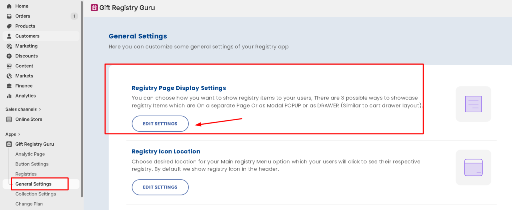
How to Open Registry Page Display Settings #
- Go to your Gift Registry Guru Dashboard
- Click on General Settings in the left-hand menu.
- Select Registry Page Display Settings.
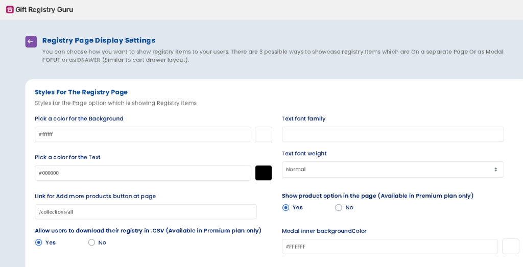
Styles for the Registry Page #
This section controls the overall look of the registry page — the foundation that all other elements sit on.
- Pick a color for the Background – Set the background color of the registry page using a hex code.
- Pick a color for the Text – Set the default text color on the registry page using a hex code.
- Text Font Family – Choose the font family for all text displayed on the registry page.
- Text Font Weight – Set the font weight (e.g., normal, bold) for registry page text.
- Link for Add more products (bottom of page) – Customize or set the URL for the “Add more products” link shown at the bottom of the registry page, so shoppers can quickly jump back to shopping.
- Show product options in the page – (Available in Premium plans only) Toggle Yes or No to control whether product variant options (size, color, etc.) are visible on the registry page.
- Allow users to download their registry (CSV) – (Available in Premium plans only) Toggle Yes or No to allow registry owners to download their registry as a CSV file.
- Modal Inner Background Color – Set the background color for modals (popup dialogs) that appear on the registry page.
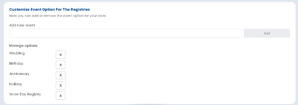
Customize Event Option for the Registries #
This section lets you control which event types are available for customers to choose from when creating a registry on your store.
- Add New Event – Click the Add button to create a new event type.
- Manage Options – Edit or remove existing event options. The default event types shown include:
- Wedding
- Birthday
- Anniversary
- Holiday
- Baby Shower
You can add custom event types to match your store’s niche — for example, “Housewarming,” “Graduation,” or “Back to School.”
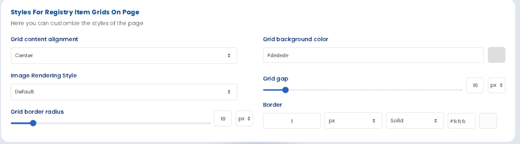
Styles for Registry Item Grids on Page #
This section controls the layout and appearance of the product grid displayed on the registry page.
- Grid Element Alignment – Set the alignment of product cards within the grid (e.g., center, left).
- Grid Background Color – Set the background color behind the product grid.
- Image Rendering Style – Choose how product images are displayed within their grid containers.
- Grid Gap – Control the spacing between product cards in the grid (in pixels).
- Grid Border Radius – Set the corner roundness of each product card in the grid (in pixels).
- Border – Set the border width, style, and color for product cards in the grid.
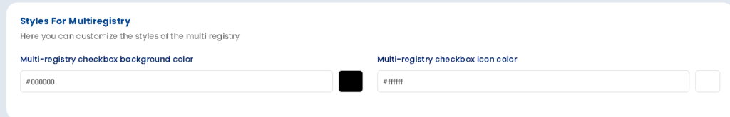
Styles for Multi Registry #
This section is relevant if you have the multi-registry feature, which allows customers to create more than one registry on your store.
- Multi Registry Checkbox Background Color – Set the background color of the checkbox used for selecting between multiple registries.
- Multi Registry Checkbox Icon Color – Set the icon/tick color inside the multi-registry checkbox.
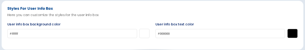
Styles for User Info Box #
The User Info Box displays the registry creator’s details (name, event date, etc.) at the top of the registry page.
- User Info Box Background Color – Set the background color of the user info box.
- User Info Box Text Color – Set the text color of the information displayed inside the user info box.
Styles for the Move to Cart Button #
The Move to Cart button appears on the registry page and allows gifters to add a registry item to their cart. This section lets you fully customize its appearance across three states.
Use the Regular, Hover, and Active tabs to style the button for each interaction state.
Button Settings #
- Pick a color for the Background – Set the button’s background color using a hex code.
- Border Radius – Set the corner roundness of the button (in pixels).
- Padding (Top & Bottom) – Control the vertical padding inside the button.
- Padding (Left & Right) – Control the horizontal padding inside the button.
- Margin (Top & Bottom) – Set the vertical spacing outside the button.
- Margin (Left & Right) – Set the horizontal spacing outside the button.
- Border – Set the border width, style, and color of the button.
Text Settings #
- Text Color – Set the button label text color using a hex code.
- Font Size – Set the text size inside the button (in pixels).
- Font Family – Set the font family for the button label (Shopify default font family works only).
- Font Weight – Set the font weight (e.g., normal, bold) of the button text.
- Text Align – Set the alignment of the text within the button (e.g., center, left).
Customize Nav Menu Styles #
The Nav Menu appears on the registry page and allows registry owners to navigate between different views or sections of their registry (e.g., registry items, purchased items, shared view). This section lets you style the nav menu tabs across three states.
Use the Regular, Active, and Hover tabs to style each state.
Text Settings #
- Pick a color for the Background – Set the background color of the nav menu tab.
- Text Color – Set the tab label text color.
- Font Size – Set the font size for the nav menu text (in pixels).
- Font Family – Set the font family for the nav menu labels (Shopify default font family works only).
Share Page Tabs Menu Styles #
The Share Page Tabs appear on the gifter’s view of the registry page, allowing gifters to switch between different sections (e.g., all items, purchased items). Style them across three states using the Regular, Active, and Hover tabs.
Text Settings #
- Pick a color for the Background – Set the background color of the share page tab.
- Text Color – Set the text color for the tab label.
- Font Size – Set the font size for the tab text (in pixels).
- Font Family – Set the font family for the tab labels (Shopify default font family works only).
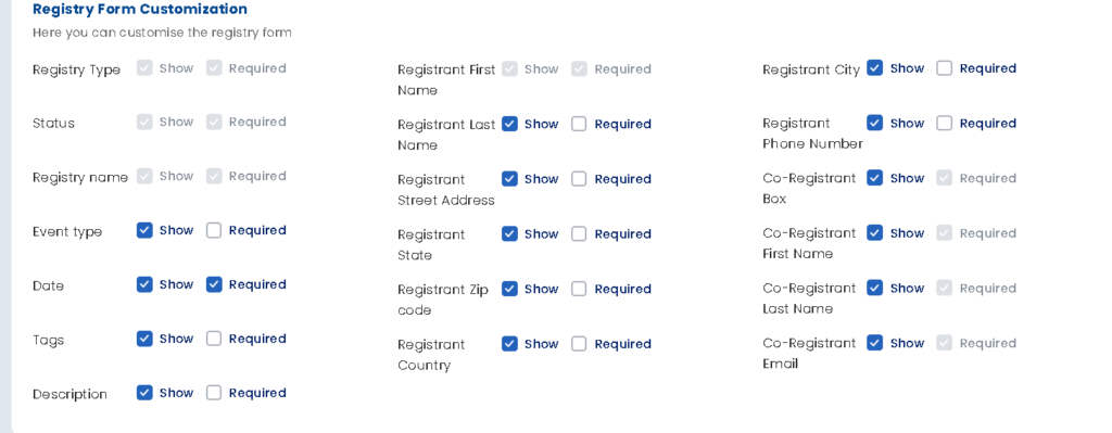
Registry Form Customization #
This section controls which fields appear on the Create a Registry form that customers fill in when setting up a new registry. For each field, you can set:
- Show – Toggle whether the field is visible on the form.
- Required – Toggle whether the field must be filled in before the form can be submitted.
Frequently Asked Questions #
Where do I find the Registry Page Display Settings?
Go to Gift Registry Guru Dashboard > General Settings > Registry Page Display Settings.
Can I add my own event types to the registry creation form?
Yes. In the Customize Event Option for the Registries section, click Add to create a new event type, or manage (edit/remove) existing ones.
Can I hide fields from the Create a Registry form?
Yes. In the Registry Form Customization section, toggle Show to off for any field you don’t want to appear on the form.
Can I make certain registry form fields optional instead of required?
Yes. Use the Required toggle in the Registry Form Customization section to control which fields must be filled in before a customer can submit the form.
Are the Move to Cart button styles the same as the Add to Registry button styles?
No — they are separate. The Move to Cart button is styled in Registry Page Display Settings, while the Add to Registry button is styled in the Add to Registry Button Appearance section of the dashboard.
Which settings are only available on Premium plans?
The Show product options on page toggle and the Allow users to download their registry (CSV) option are both available on Premium plans only.


